
PaginationIndicator
PaginationIndicator
オープンベータ版ドキュメント:本テクニカルドキュメントは、リリース前のオープンベータ版の一部としてAmazonから提供されるものです。ここで説明されている機能は、Amazonがフィードバックを受け取り、機能の開発を繰り返す過程で変更される可能性があります。最新の機能の情報については、最新のリリースノートを参照してください。
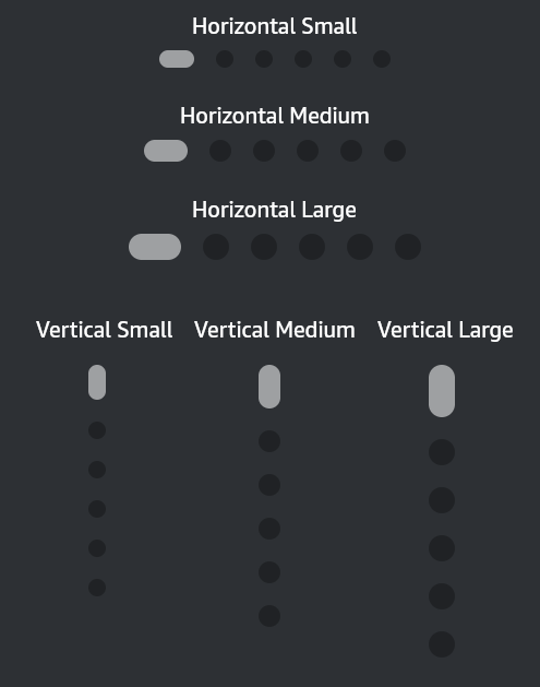
PaginationIndicatorコンポーネントは、ページ数と現在アクティブなページを示す視覚的なインジケーターを提供します。
使用方法
インポート
import { PaginationIndicator } from '@amazon-devices/kepler-ui-components';
例
<PaginationIndicator
  activePage={3}
  numberOfPages={6}
  activeColor={'#FF12FF'}
  inactiveColor={'#FAFAFA'}
  size='md'
 />
プロパティ
| プロパティ | 型 | デフォルト値 | 必須 | 説明 |
|---|---|---|---|---|
numberOfPages |
数値 | なし | ○ | 合計ページ数。 |
activePage |
数値 | なし | ○ | 現在アクティブなページ(0ベース)。 |
size |
'sm'、'md'、'lg' | 'md' | × | PaginationIndicatorのサイズ。 |
activeColor |
ColorValue |
undefined | × | アクティブなインジケーターの色。 |
inactiveColor |
ColorValue |
undefined | × | 非アクティブなインジケーターの色。 |
vertical? |
ブール型 | false | × | 垂直方向に設定します。 |
カスタマイズ
カスタマイズとして、アクティブまたは非アクティブな状態の色と、サイズのオプションを指定できます。
対話操作
| モダリティ | 利用可能 |
|---|---|
| D-Pad | × |
| タッチ | × |
| 音声 | × |
アクセシビリティ
| プロパティ | 利用可能 |
|---|---|
accessible |
× |
accessibilityRole |
× |
accessibilityLabel |
× |
accessibilityValue |
× |
accessibilityActions |
× |
accessibilityState |
× |
UIエクスペリエンス
Last updated: 2026年6月9日
